
Background
Radio Kingston is a non-commercial platform dedicated to a vibrant, just, and healthy Kingston centered around community storytelling, artistic and musical expression, conversation and connection. It is located in the city of Kingston, NY, where I have worked and lived since 2015.
I worked on this project both as a UI/UX designer and front end developer support (primarily focused on styling and building writing component markup in JSX/React) during the time I worked on the front end team at Moonfarmer (2017-2018). I worked with my team of 5 people to design this site using text styles and components in a consistent way that could be translated by our developers easily. We also worked in Sketch symbols (this was pre-libraries, ouch.), keeping our React components in mind. We worked on this in an agile methodology in 2 week sprints. For a year, we added new features, took in user feedback, and improved the overall user experience on the website, and eventually on the cross platform app.
The Radio Kingston website launched the same day as the station itself went live on November 1st, 2017. Leading up to the launch, Moonfarmer was tasked with preparing a MVP website for the station that would show basic information about the on air hosts, a schedule of the shows on the air, and basic information about the station. From that inital MVP launch we built in just a few weeks, we iterated every two weeks until we got close to the site you see today after a year of development.
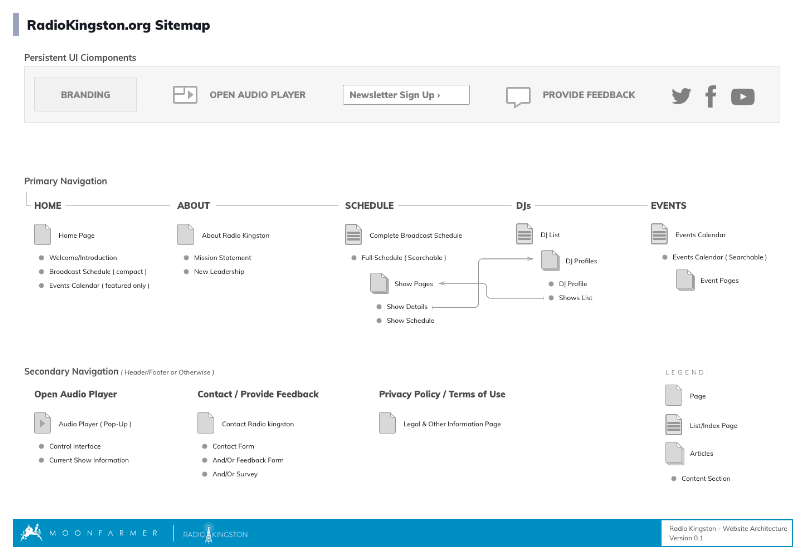
Information Architecture / Wireframes
The head of our front end team made the site map/application diagram for the site (pictured below), and I used that to create the wireframes below. I linked up the pages of the wireframes in Marvel so that when we presented them we could make it so the stakeholders could try it out for themselves and see if the content relationships made sense to them.
Visual Design
After our wireframes were approved, we started experimenting with what kind of look and feel we wanted to establish for the website and corresponding pattern library. Below are some different options we explored before we settled on our final option. We needed this design to be accomodating to switching back and forth between English and Spanish, because a feature we built into the site was the ability to switch the language without reloading the page. The React app made it so we could switch out the content in the strings on the page without reloading styles or making any other changes to the DOM.
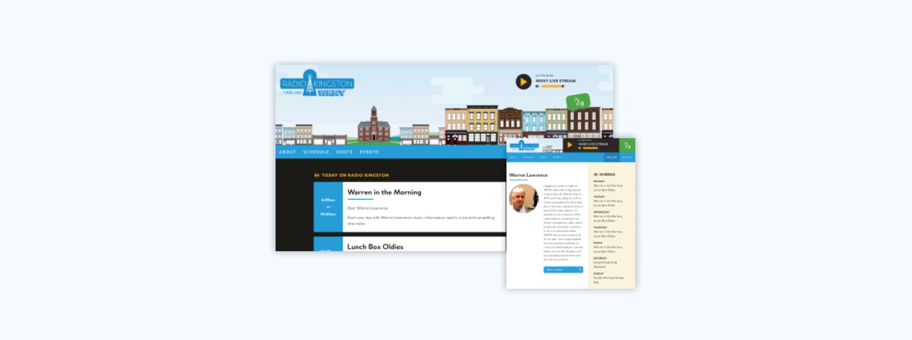
Something we ran into during the design process was we wanted the site to feel like Kingston. In our earlier proposed designs, we were stongly tying the design to the elements in the logo they were using. The branding at the time wasn’t what they intended on keeping, so we were advised to not worry so much about “matching” the identity. We needed to establish a look and feel that would work still if we switched out the logo. Eventually, we landed on the idea of incorporating illustrations of some buildings around our city to give the site a more “Kingston” feel.
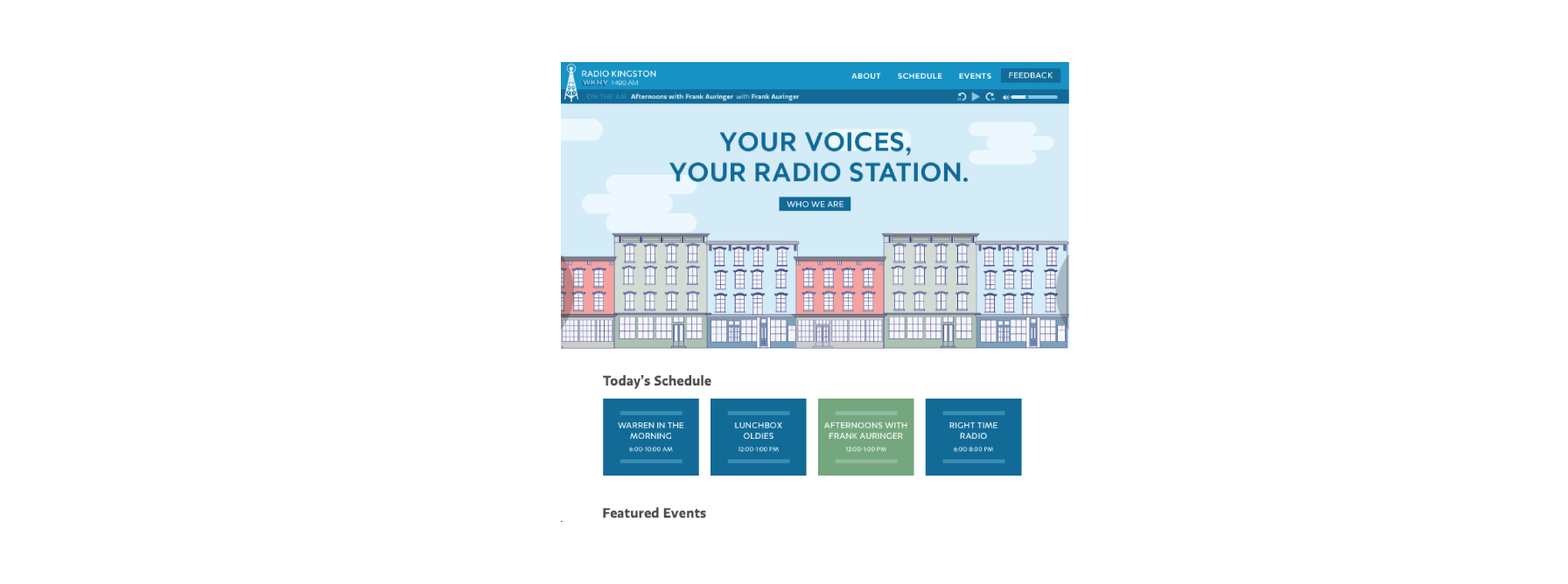
Finalized Design
We honed in more on the buildings concept and built it out to be what went on to be the inital release of radiokingston.org. We were on a tight deadline, so we ultimately decided to do some key screens in high fidelity and take the cues from our wireframes for the rest. At this point of the project, I switched over to help on front end dev to style React components as they were being built. It was a lot of work, and the deadline was tight, but ultimately our team got the site where it needed to be on the day of the station annoucouncement.
Website Features Added in Later Sprints
We did not get to do everything we wanted to do in the intital release of the Radio Kingston website. We had a one year contract to work in agile sprints, where we would work on new features and enhancements, release them every two weeks, and collect . The process of building this website was truly iterative, and we worked in two week sprints, utilizing boards in JIRA. After the site initially launched, we discussed with the leadership at Radio Kingston and collected user feeedback to get insight on what features were going to be our top priorities. From there, our project managers created a a roadmap of future sprints.
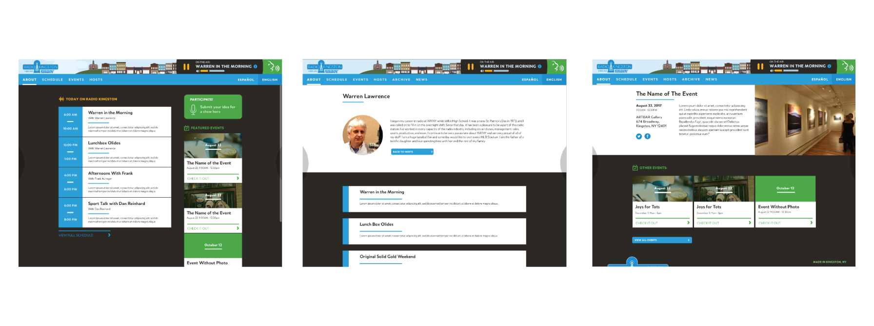
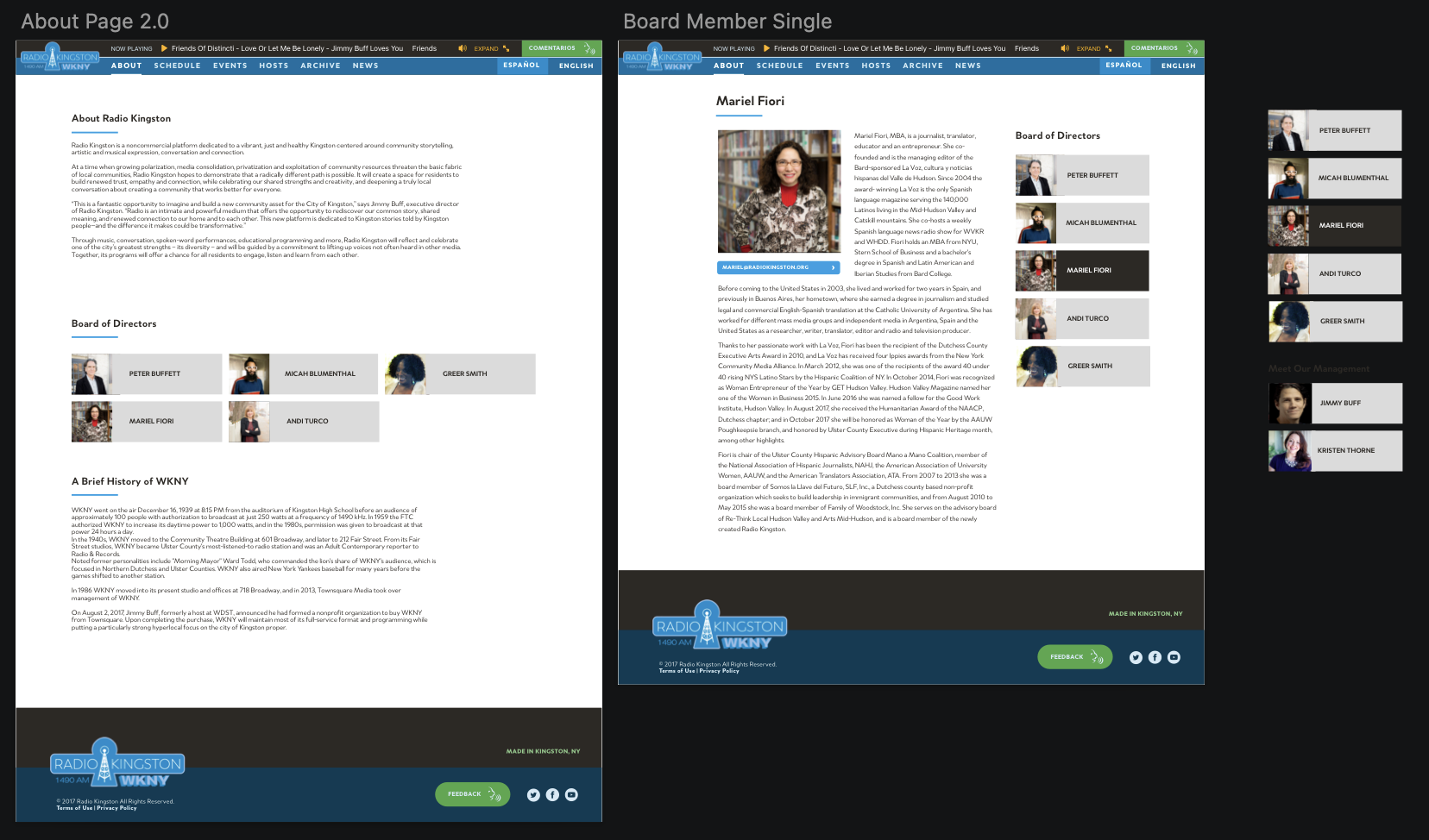
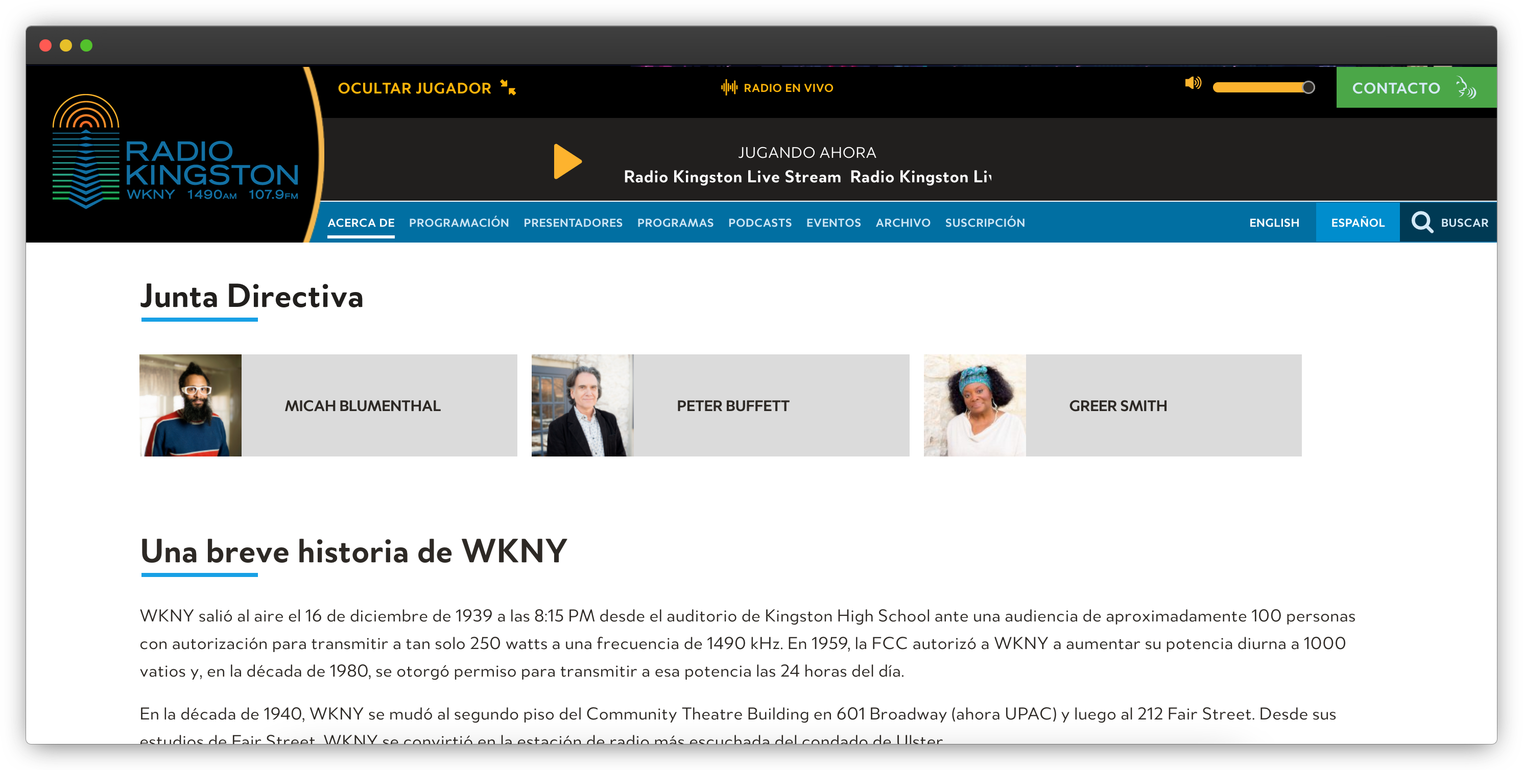
About Page + Addition of Board of Directors
My first assignment for a UX enhancement on the site was on the About page. At the time of launch, it was just a paragraph on a page with a little overview of what Radio Kingston is. The team at Radio Kingston wanted to make themselves more accessible to their listeners and put faces and names to the organization. Utilizing mostly exsisting components from building out the rest of the site, I created a solution to show all the board member’s information to more efficently connect them to the public.
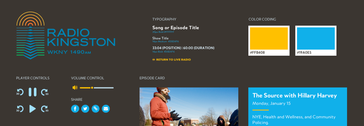
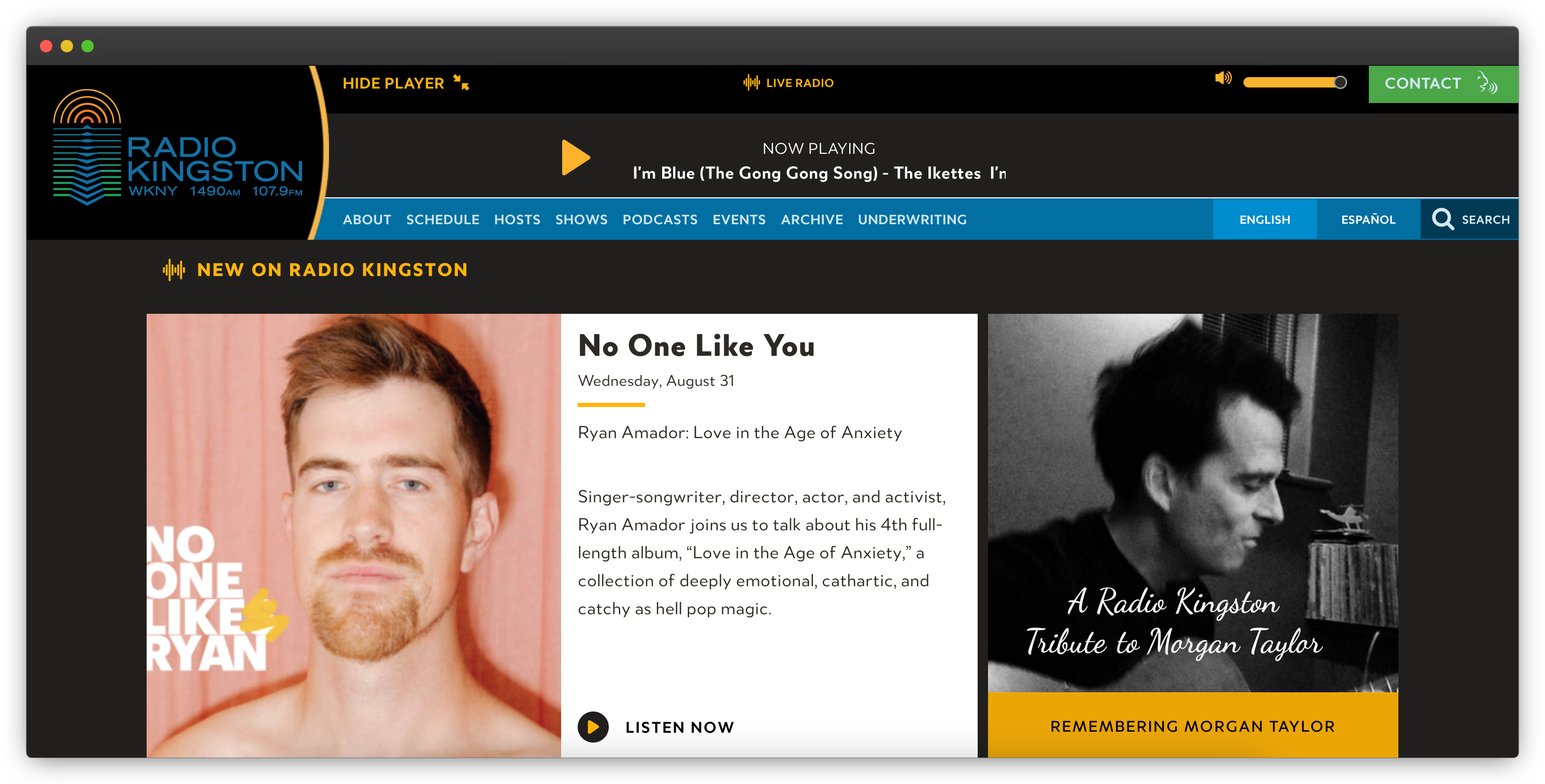
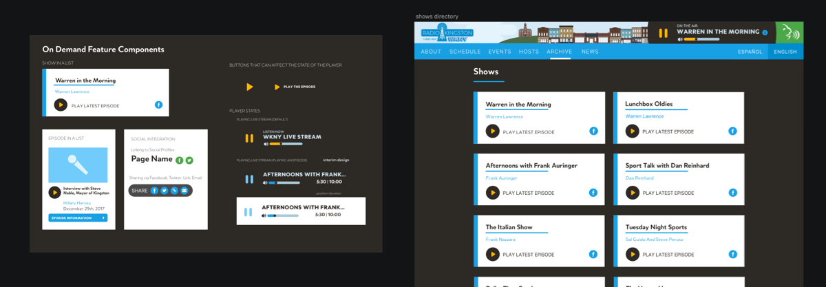
Media Player Experience + Archive Release
One of the most critical aspects of the Radio Kingston user experience was it’s audio listening experience. We did release an audio player as a persistant UI component from the start, but it was about to become a lot more advanced, as we were beginning to lay the groundwork to allow show hosts to post recorded audio of past broadcasts to the website for site visitors to listen to.
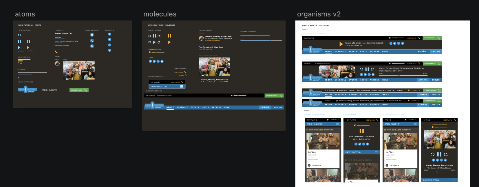
Today, this is the main use of the Radio Kingston website, and is a large reason why I view this as a software project and not a just a web design project.
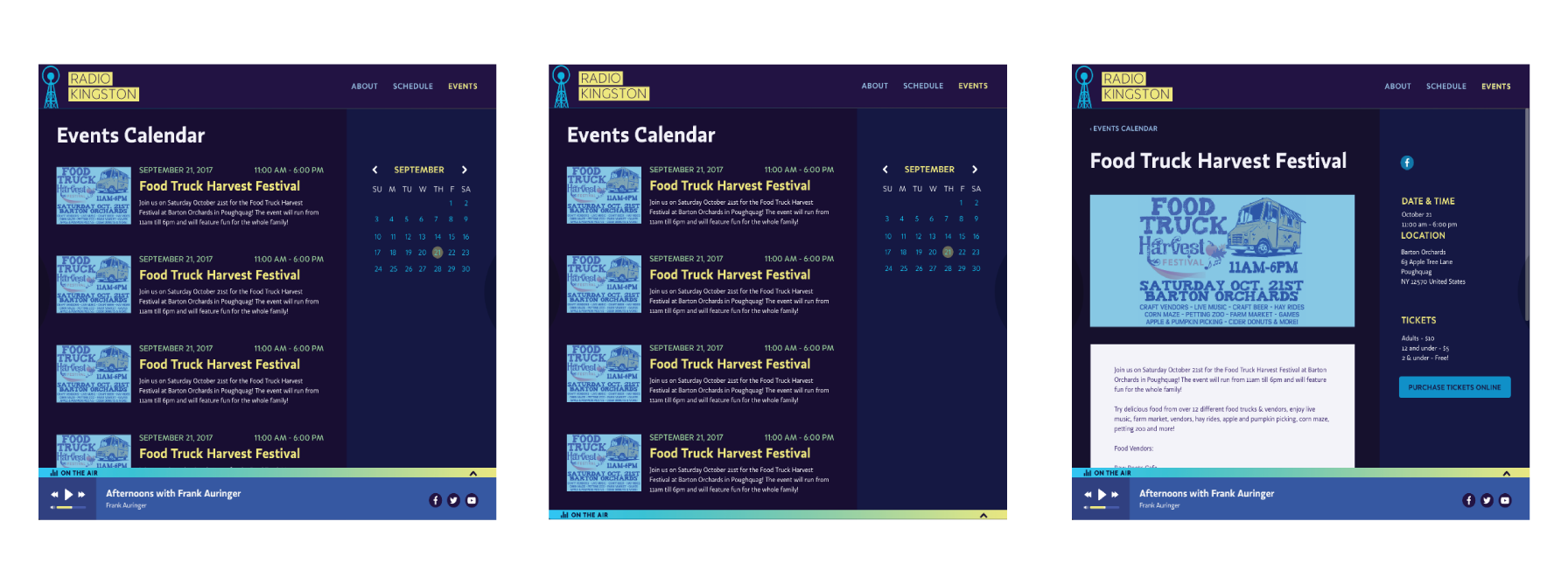
Search
After the episodes archive launched, it became evident pretty quickly that users needed a better way to locate older episodes of shows that were posting at a high volume (some Radio Kingston shows broadcast five times a week!). Also, as time went on, more shows were getting added to the lineup on the station.
As a team, we decided that having a site-wide custom search was going to be what was best for our users. We didn’t want to jam in some generic search solution that wouldn’t understand the context of the station’s website, so when we were were developing the mechanics, we decided to offer the option to filter the kinds of content the search would return. We also had to develop a component for search results that would properly display every kind of content we had on the site.
Podcasts
In late April of 2018, Radio Kingston annouced that it would be offering its studios and resources to aspiring podcast hosts in our city. Some exsisting shows were also going to start exsisting as podcasts too. While the content type of podcasts was quite similar to what we had from our exsisting archive experience, these would also be ditrubuted out over tradional podcasting platforms and would not appear in the Radio Kingston show schedule.
Stakeholders at Radio Kingston also wanted us to differentiate anywhere that listed shows or episodes whether they were from a podcast show or a “broadcast” show.
When incorperating this feature, I had to refactor any pages on the site that this feature would touch so that our engineering team would know what to do. In order to do this with the least possible friction, I collaborated with our project managers and the engineer who would be working on development of the feature in our next sprint.
Show Card Refactor
After we had done all of this work on the shows archive and podcasts, the site had pretty much fully shifted from being an informational website about a radio station to a browser based audio experince. Considering this, the way wer presenting shows as types of content didn’t really make sense anymore. We were getting a really positive response about the cards we used for podcasts and broadcast episodes and our analytics data was showing there was too many steps between the user finding a show and being able to access an episde of that show to start listening to it.
We decided refactor the show cards’ design to align more to the episode cards. We wanted to provide imagery so the pages that listed shows would be more visually appealing and provide more context to the user.
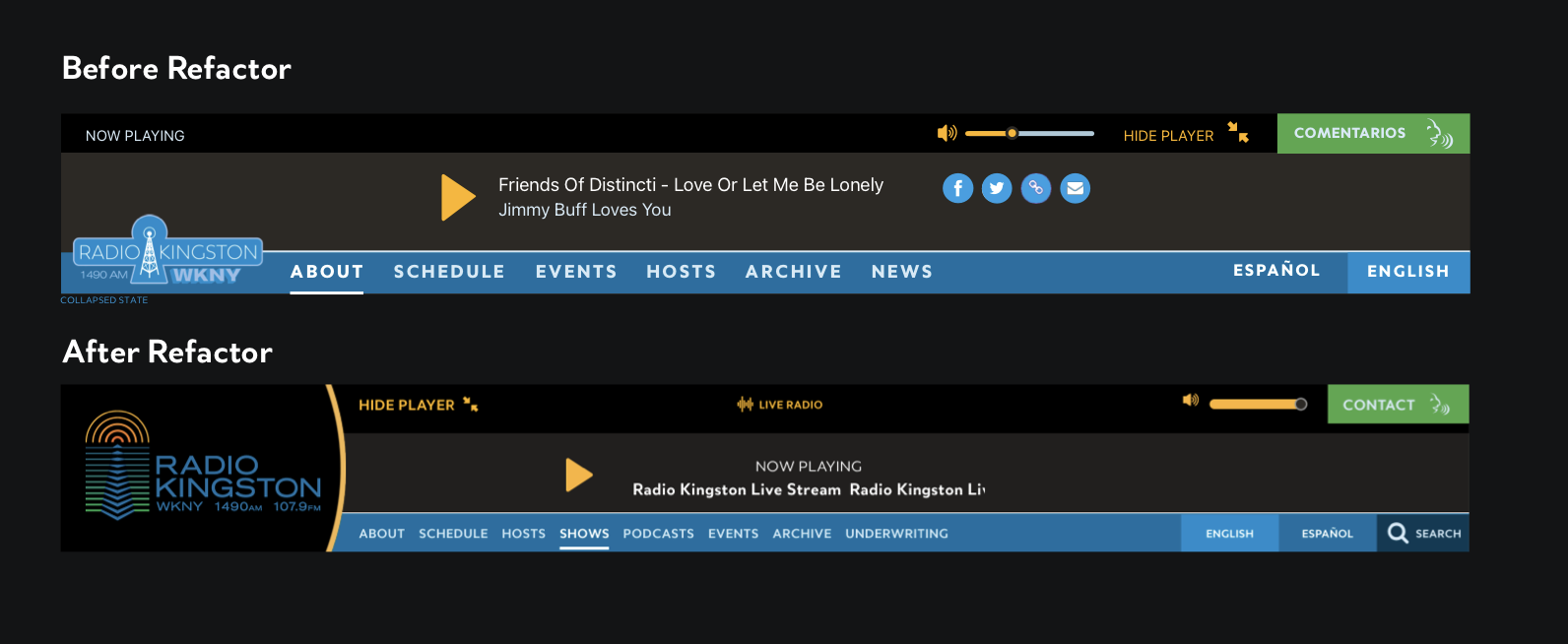
Incorporation of New Branding
After months of working with a freelance designer, Radio Kingston was ready to release their new branding. They wanted to roll it out across all of the platforms their brand exsisted on. For our team, that meant the website, both apps, and all the Radio Kingston social media platforms. As the main designer on this project, it meant that my work was cut out for me!
![]()
Refactoring the Website Header
My first task in this was refactoring the site header to accomodate the new logo, which was a completely different shape and had to fit into the composition in the various states of the header that had been developed in the media player experience. My expereince building this header out as a developer helped a lot when understanding the constraints how how we had initally built it and what was going to be the most efficient way to refactor without having to rebuild the whole component.
Outcome and Lessons Learned
This was a pivotal experience for me in my career, it was the first large scale agile project I ever worked on. I was assigned and dedicated to it for over a year. It was where I formed my more formalized approach to design systems, in both best practices implementing a design system in React and building and maintaining a collection of Sketch Symbols. This was also the first place I got to write prodiction code in React, and where I moved away from working in Wordpress and pursuing custom software as my career focus.
I still live in the city where this station is located and it’s kind of my claim to local fame that I designed and helped build this platform. At the time of writing this in 2022, this project is 5 years old and I’m still pretty happy with how it all came out overall. Something that makes it so special is how much user feedback we incorperated as we built it.