
Background
The Space Force portal is a web application by a team called “ORBIT” worked on with the United States Space Force. The United States Space Force is the space service branch of the U.S. Armed Forces and the world’s only dedicated independent space force. Along with the U.S. Air Force, the Space Force is part of the Department of the Air Force, led by the secretary of the Air Force.
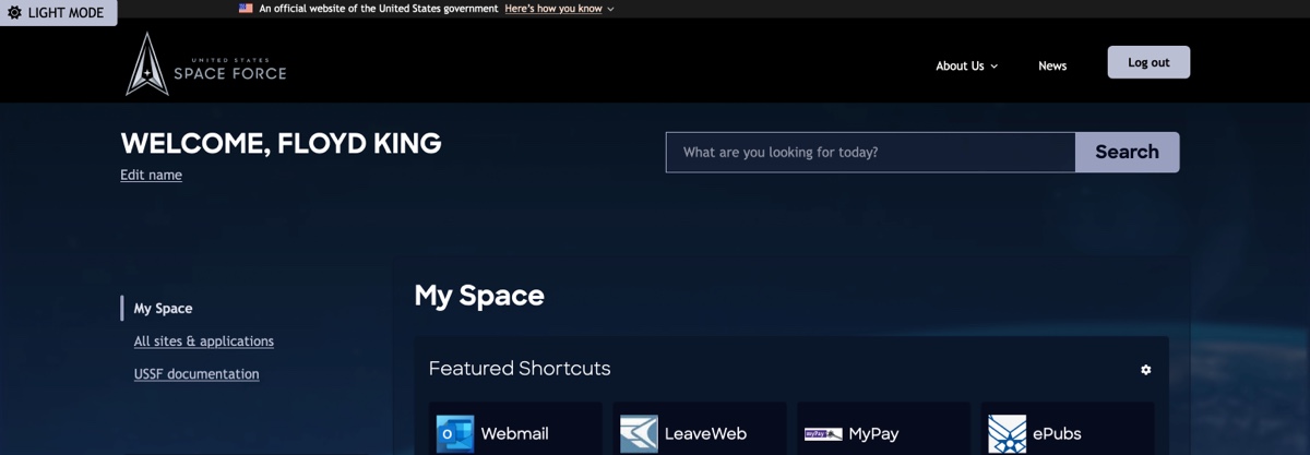
This is an internal employee intranet system for Space Force employees and enlisted, called Guardians, who have been involved in shaping and testing the system from the project’s inception.
I worked on this project as a part of a team of nine, as one of the two designers on the project. I joined two years into the project in September of 2022. My role on this project was a UX engineer and accessibility specialist, while also contributing to usability research planning and session facilitation in a supporting role.
Orbit Design System
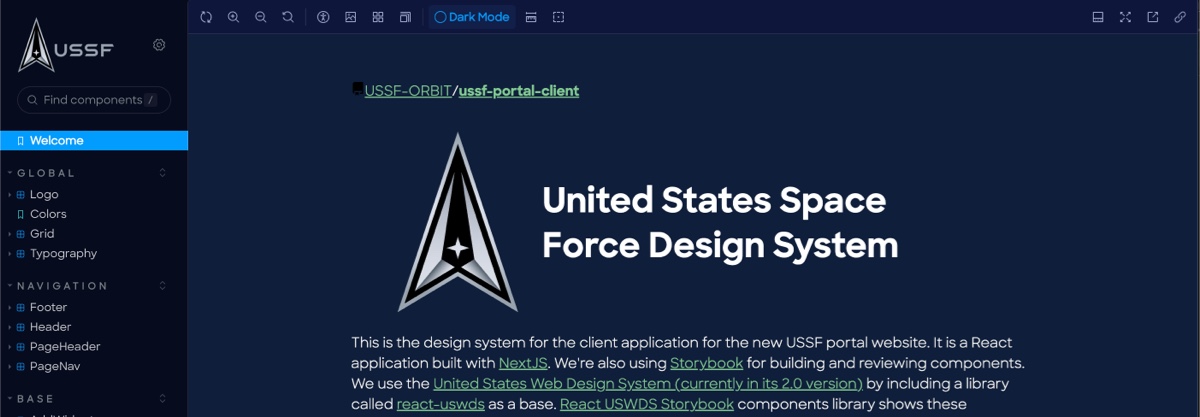
The Orbit Design system is a components and shared styles system built on top of the United States Web Design System. Our team maintained the design system both as a Figma library and as a Storybook site which displays our actual components as they appear in the app.
The design system is a highly collaborative aspect of this project, and is led by the design and engineering teams together. In my time on this project, I developed an organization system for our storybook, made performance improvements, audited for accessibility, and and helped maintain front end dependencies, such as the USWDS component library we build on top of, an open source project maintained by Truss, called react-uswds. Below are some PRs I’ve worked on that show my contributions to the Orbit Design system in 2022–2023.
Initial Storybook Enhancements
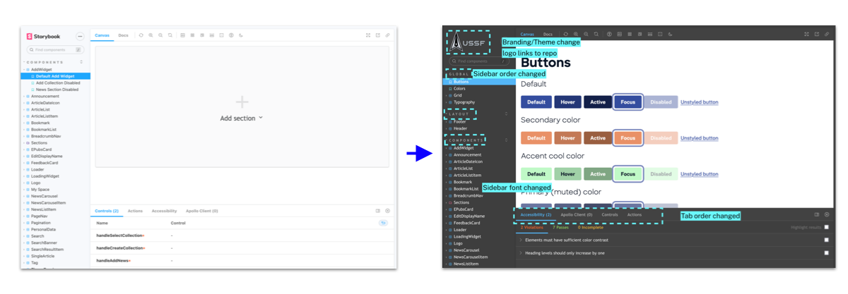
One of the first projects I took on when I joined the project was improving the appearance of the project storybook. More detail in the PR, but some highlights include:
- Installs the Storybook Themeing Addon so we could style the interface of the storybook instance Adjusts storybook theme preferences (switches to dark theme and USSF colors for the background) and adds USSF branding
- changes the order of Storybook Roots (Global, Layout, Components) to be in an order that puts the most global things up top so they don’t get lost behind the big components list (later on I end up breaking this large root into several smaller ones).
- changes order of Storybook Addons import to make it so the ones that are more commonly used by components are shown first.
- switches Storybook font (used in sidebar items and storybook interface) from System Font to Sharp Sans, one of our brand fonts
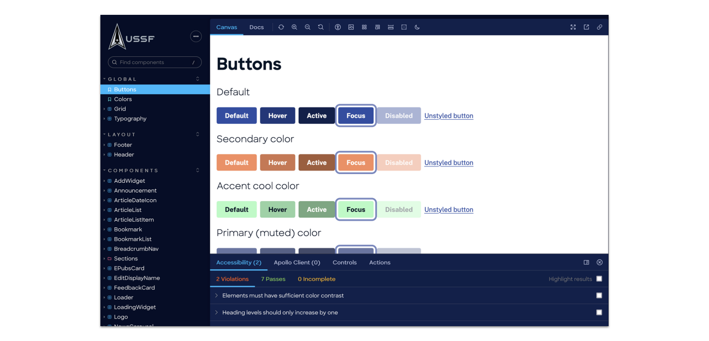
The Orbit Design system Storybook on GitHub Pages
Design PR Review Guide
PR Review Process for Space Force Designers
Another thing I did when I joined the project was ensure we implemented a designer review process for front end PRs. The team had one when the project started but had fallen to the wayside over the course of a couple staffing changes.
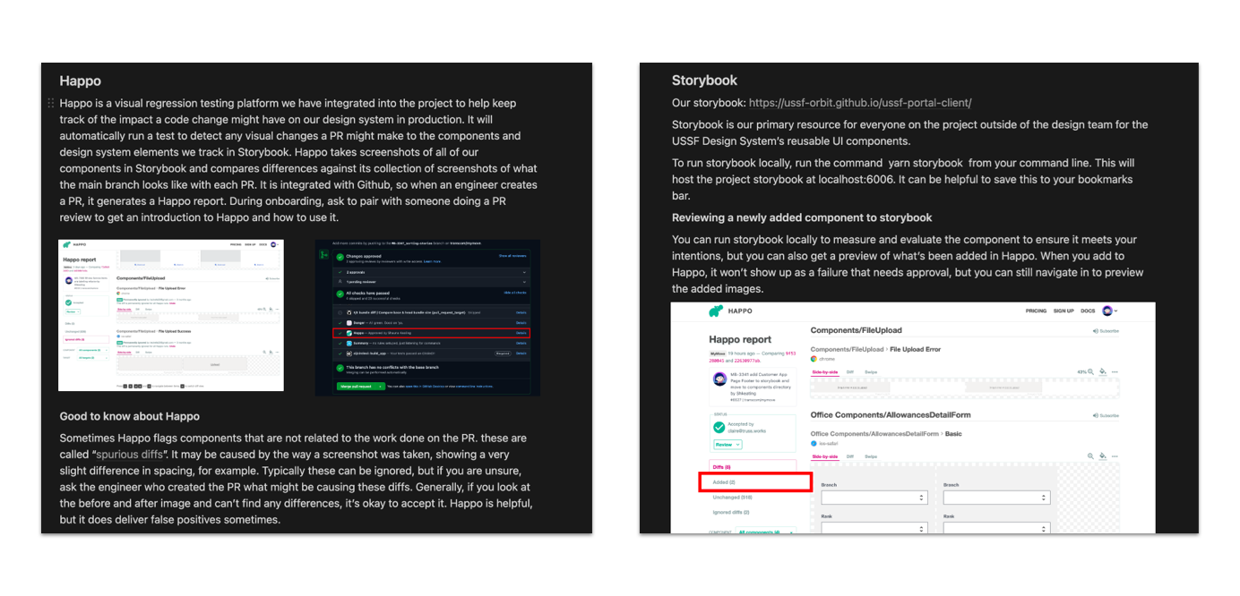
I brought my expertise from the effective design review process for front end PRs we had implemented on the MilMove project to build this documentation to train new designers and non-engineers who wanted to participate in conducting review of components in the design system in PRs on GitHub.
The guide includes information on what Storybook is, how to get tagged in a front end PR, how our visual regression testing tooling works, and how to run the application on your machine in terms more friendly to non-engineers.
Storybook Reorganization
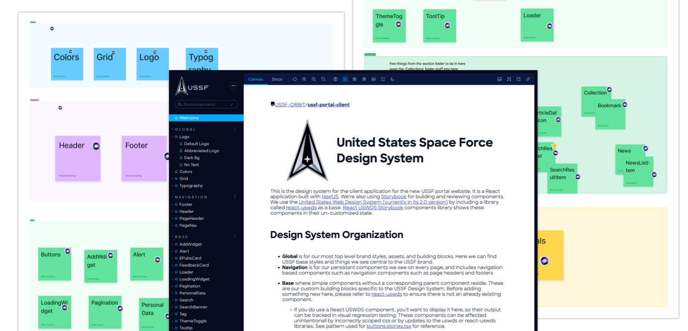
After some time on the project, I noticed the design system storybook was not being used by the team as much as I would like to see, and didn’t relate to the organization of our Figma library in a way that would ensure alignment across disciplines on the design system and how it worked.
The designers on the team paired to take inventory in Mural of all our components and worked together to figure out what information hierarchy would scale well and ensure folks could find the component they needed to reference more quickly. Once we had an idea of how we wanted to approach it, we showed the engineers, who helped us iterate and arrive on a decision of what our best approach would be.
From there, I went through all our components’ stories files and adjusted what roots and folders the components would appear in to align to the information architecture we decided on as a team.
Page Loader Refactor
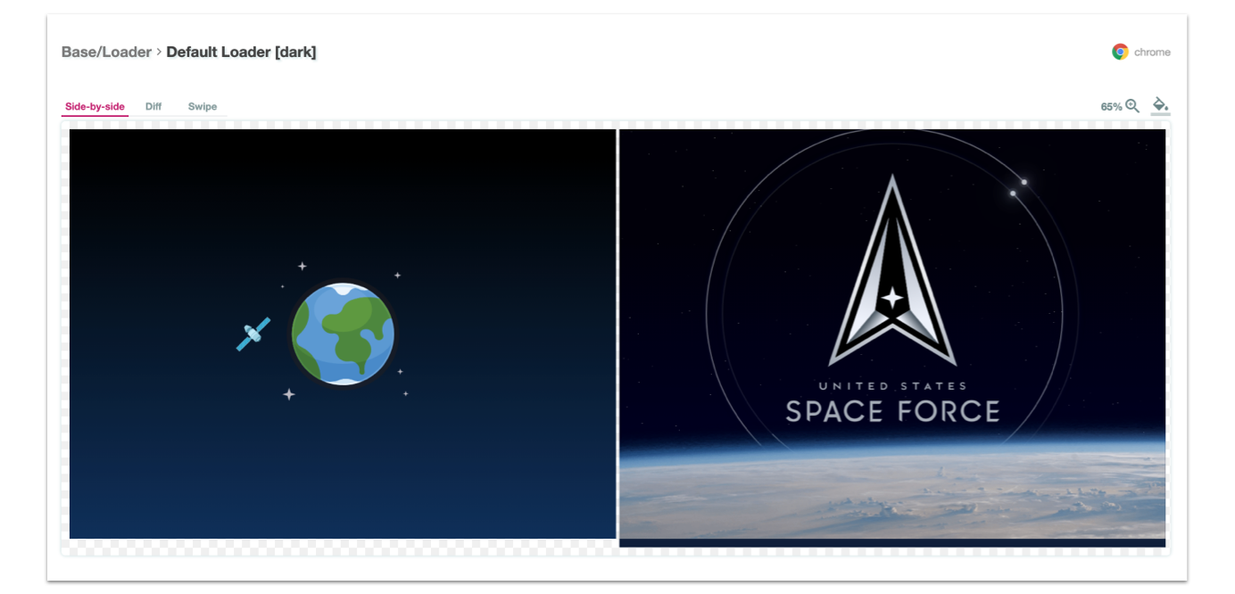
I worked on a couple iterations of our page loader in my time on the project. Once early on, I had some extra time at the end of a sprint and decided I couldn’t look at the somewhat silly loader we had in place from the early stages of the project. I also felt it did not relate to the work of the Space Force very much, as most Guardians are monitoring satellites orbiting the earth.
The first iteration featured a satellite orbiting an earth and combined a few keyframe animations to make it possible. After about 10 months, we were able to collect user and stakeholder feedback to create a new version that took needs of a more professional polished look into account, while still keeping it visually pleasing in a way that delighted users who sometimes would spend a decent amount of time day to day at bases with throttled connections.
In both versions, there were constraints I considered, such as making sure the loader animation was something that would not cause issues for folks with vestibular disorders, and that the loader did not use too many image assets that could cause the loader to not load efficiently. Something I am considering long term, is adding a mechanism to pause the animation which currently does not exist.
live version of page loader in Orbit Design System Storybook
Accessibility of the Space Force Portal
Accessibility Plan
I collected the processes we developed and information our team had in an Accessibility Plan, a living document that we maintained over time to keep track of stakeholders (such as your government agency’s Section 508 program manager), assistive technology targets, the tools we use to do automated and manual testing, what our client wants to see in our compliance report, and more. On my team, I am the point person on the accessibility plan, but anyone on my team can contribute and make adjustments to it.
More detail on the accessibility planning and assessment process I’ve shaped within my organization can be found in my post Integrating accessibility compliance into your software development process on the Truss blog.
Our accessibility plan, and the scorecard we used to shape it and our priorities led to many incremental accessibility wins, from building a process around iterating on our compliance reporting and keeping it up to date with each release, to prioritizing remediation work in our backlog, and building sustainable review processes to ensure accessibility in incorporated from the start of the development process.
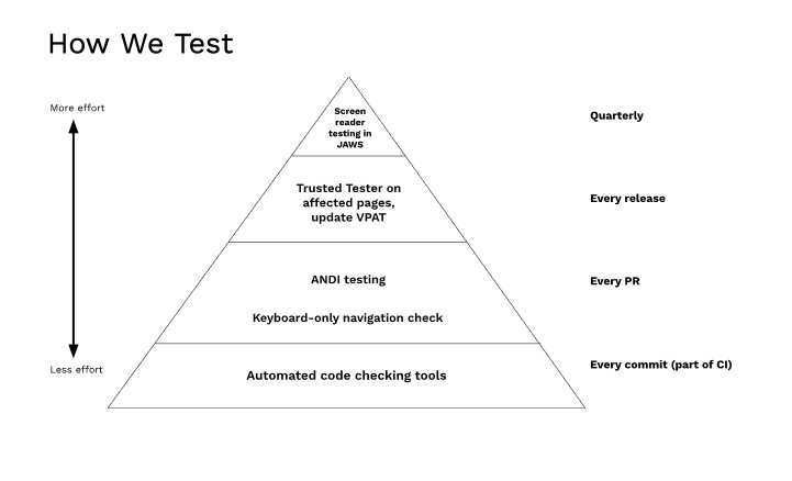
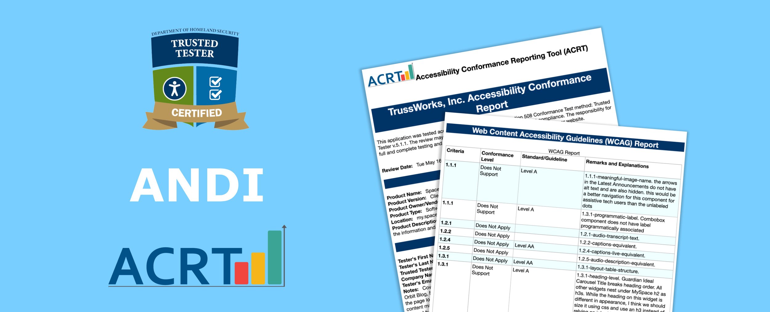
Our accessibility plan also outlines what testing occurs at what stage of the process, including basic automated linting, to manual testing in ANDI with each PR, to re-testing prior to each release to update our Accessibility Conformance Report / VPAT, and even testing with real users with disabilities several times a year.
Accessibility Conformance Reporting
Since this is a project for a federal government client, there are pretty strong requirements around conformance reporting. For our contract, we were required to align with WCAG at the 2.0 AA level. It’s worth noting, that this standard is pretty old and was published in 2008, and is not appropriate in many software projects nowadays, especially when they are focused on modern devices such as phones and touch screens. The intent of this product is that our users aren’t supposed to be accessing the system outside of their goverment computers, so we felt this standard would be sufficient for now, and that once we were meeting it we could aim higher, as we work in an interactive agile fashion.
As requested from the client and verified by our Air Force Section 508 coordinator, we followed the Trusted Tester 5.1.x standard (in Q3/Q4 2023 v 5.1.3 is set to come out and Trusted Testers, including myself are expected to change to the new version in our assessments). I use the tool ACRT to generate reports following the process, which converts the Trusted Tester standards over to WCAG standards and level assignments automatically in PDF form.
Read more: Navigating the VPAT Journey: Testing & Reporting for Accessibility Compliance
Remediation Work
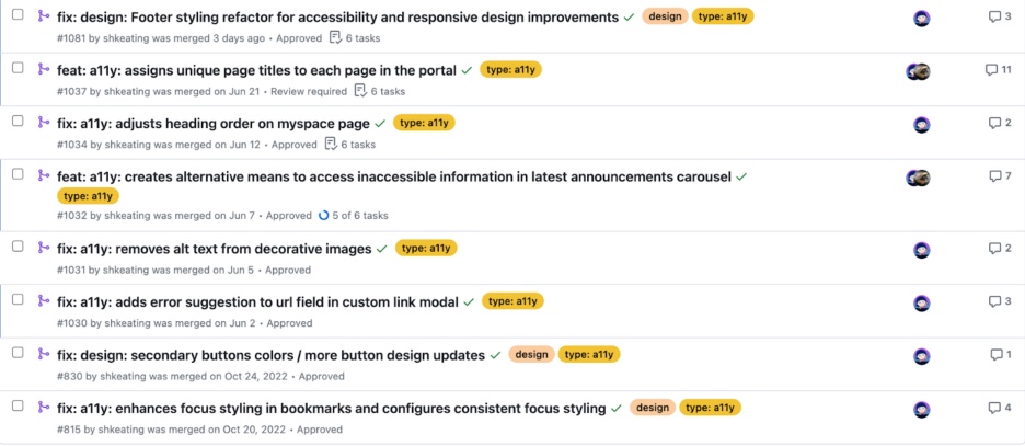
I also on this project went into the code and contributed to remediation work to the extent of my ability as an engineer. While I do not consider myself a software engineer, I do in this work step outside the usual bounds of a design practitioner into making adjustments to our jest and playwright tests to account for things such as a new accessible name on a button or link.
I’ll often pull small wins into the scope of other design system component work and use accessibility related usability feedback to help drive design decisions.